Abstract | Introduction | Literature Review | Research question | Materials & Methods | Results | Discussion | Conclusion
In this blog, we look at how to write the results section of a research paper. We will go through plenty of results examples and understand how to construct a great results section for your research paper.
1. What is the purpose of the results section?
The authors report their findings in the results section. This is a relatively easy section to write. You simply have to organize your results and write them up in a logical sequence. You must present your findings without evaluating or interpreting them. You must try to illustrate your data using figures and tables to make it more accessible to the readers.
2. How should I structure my results section?
The results section of a research paper typically contains the following components:
3. Examples of results section
Let’s look at some examples of the results section. We will be looking at results section examples from different fields and of different formats. We have split this section into multiple components so that it is easy for you to understand.
3.1. An example of a pre-processing passage in the results section
Here is an example of the results section from an engineering research paper where the authors talk about pre-processing. The authors are saying that they performed a series of steps before conducting the actual analysis. They are saying that they filled in the missing data using linear interpolation. And then, they transformed and normalized the data. Finally, they applied data smoothing to remove any noise in the data. As you can see the authors are very transparent and are detailing everything they did to the data before the actual analysis.
The following is a brief summary of the preprocessing steps applied prior to analysis. The data were screened for outliers and such data points were set to missing. Subsequently, the missing data were filled by linear interpolation. The data were transformed using the Box method and then normalized to zero mean and unit standard deviation. The smoothing was applied at the final step to remove the noise in the data.
_ Missing data _ Missing data fix _ Data normalization _ Data smoothing
3.2. An example of main findings passage in the results section
While presenting your findings you must clearly explain the following:
This is an example of the results section from a psychology research paper where authors are outlining their main findings. In this paper, the authors are investigating the effects of different types of music on people. The authors say that they found significant differences between classical and pop music in terms of memory recall. And then, they are saying that they did not find any differences in terms of emotional response. Finally, they are saying that they were quite surprised to find that both types of music fatigued the listeners at the same rate.
The results indicate significant differences between classical music and pop music in terms of their effects on memory recall and cognition (p<0.05). However, there was no significant difference across the groups for the emotional response to the music (p>0.05). It was surprising to find that both types of music elicited similar levels of fatigue in both groups (p>0.05).
_ What was found? _ What was not found? _ Unexpected results
It is very clear from their tone that the last result was a bit unexpected. You can see that the authors have presented their findings in an unbiased manner without any interpretation. They have listed, the positive, the negative, and the neutral results logically in the text. This is how it should be done.
3.3. An example of using statistics in the results section
The use of relevant statistics is very important while writing your results section. It offers two benefits, number one, it will help you summarize the data in a meaningful way, and number two, it will make your text sound more credible. This results example is from a social sciences research paper investigating the relationship between social media and mental health. I want you to pay specific attention to the descriptive and inferential statistics used throughout the text.
The results of this study indicate significant differences in anxiety levels between high social media usage and moderate social media usage (p<0.05). The average time spent by high social media users (5.2 ± 2.2) was considerably higher than that of moderate social media users (3.2 ± 2.2). The odds of sleep disturbance were significantly greater for high social media users (odds ratio, 2.12; 95% CI, 1.81-2.17) compared to moderate social media users (odds ratio, 1.14; 95% CI, 1.07-1.18).
_ p-values _ Standard deviation _ Odds ratio & confidence interval
The authors say that there is a significant difference in anxiety levels between high social media users and moderate social media users. Since the authors have used the word significant, they have specified the p-value of the statistical test they used to ascertain this. Then they are providing the actual values of the amount of time spent by both groups on social media. They have presented the data in the form, mean plus or minus standard deviation, which is the standard scientific way to represent this type of data. In the final statement, they talk about the odds of both groups experiencing sleep disturbances. They have provided the odds ratio along with the confidence intervals.
3.4. An example of using figures and tables in the results section
One of the important components of the results section is figures and tables. Try to present your data in figures and tables wherever necessary.
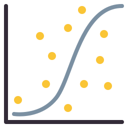

Here is a results example where authors are using figures and tables to describe their results. In the first couple of lines, they are talking about a trend in their data that relates to the change in temperature over time. They are constantly referring to the figure to get their point across to the readers. And finally, in the last sentence, they are telling the readers that the actual numerical data is provided in the table, and they can refer to it if they want. This is a standard way to use figures and tables in your research paper.
In Figure 1.1, the values are plotted as a function of time. The two peaks in the plot correspond to the maximum and minimum temperature values. The specific values obtained for each experiment are given in Table 2.
_ Figure _ Figure info _ Table
3.5. An example of elaborating trends/patterns in the results section
As a researcher, it is your job to identify trends, patterns, and relationships between different variables in your data, and tell your readers about them. Because they can reveal very important evidence that you can use to answer your research questions or prove your hypothesis.
The temperature value increases until it reaches a peak value, then decreases rapidly to zero. This effect was 10 times larger at room temperature. There appears to be a positive association between temperature and time.
_ Trend _ Pattern _ Interpreting the evidence
In this example, the author talks about his observation that the temperature changes over time in a certain pattern. Then the author talks about noticing the same behaviour under different conditions. Then based on the evidence, the author concludes that there is a positive association between time and temperature. The passage flows very well. You can clearly understand what the author is trying to say here.